
A blog by Andy Pearson
10th March 2010 at 21:46
Revealing the Grid
The previous version was a grid driven design. I knew from the outset that Critical Zero would be no different.
I want to delve deeper into the overall design of this site at some point in the near future but first it makes sense to look at the backbone of the design, the grid.
Process
Usually I start a design by creating a wireframe and basic grid, and then building on top of that framework. I very rarely have to revisit the grid once I get started.
With this site there was a definite push and pull between the design and the supporting grid. On several occasions I got to a point in the design where the grid wasn't working so I had to scrap it, recalculate and try again. One of the outcomes of this constant tweaking was the removal of gutters between columns - they where making it more difficult to create new elements that fitted well so they had to go.
The refinement of the grid eventually paid off, once everything settled down and I got comfortable with the constraints that the grid enforced. New elements would almost design themselves.
Most of the vault went that way, the grid literally told me where everything should be, the numbers confirmed it and once everything was in it all looked right.
Vital Stats
The final (all important) numbers:
- Total Grid Width: 960px
- Base Unit: 6px
- Margin: 12px
- Baseline: 24px (with a 12px offset rhythm where required)
- Column Width: 48px
- Column Count: 20
#grid
Throughout development I used the wonderful #grid to ensure everything was adhering to the grid. It's an invaluable tool, particularly useful when typesetting to a baseline grid where you need to ensure every element is keeping rhythm.
Structure
As you will hopefully see below I chose a non-symmetrical three column grid which suited the content and the overall aesthetic I was aiming for.
- Columns 1–5: Header Content
- Columns 7–16: Main Content
- Columns 18–20: Additional/Meta Content
Column numbers go from left to right, 1–20. Columns 6 & 17 are left blank to act as gutters.
The Reveal
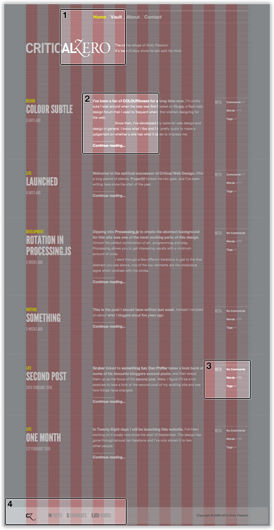
The logo overhangs into the eighth column whilst the navigation above it begins in the sixth column. This is the only place in the core layout where an element breaks the grid.
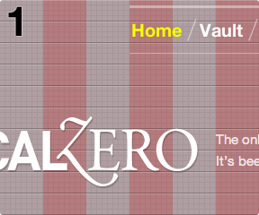
The two column indent from the logo is repeated in the content area using paragraph indents and over-lines. Together they help to strengthen the relationship between the header and content area.
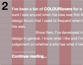
Although small, the three column sidebar has just enough room to fit some important post meta data and repeats the double column width yet again.
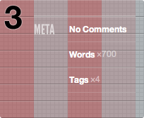
The Critical Zero logo mark anchors the left hand side of the footer whilst the main content starts in the third column, once again mirroring the two column spacing. The footer also reveals the twelve pixel margin which surrounds the whole site.